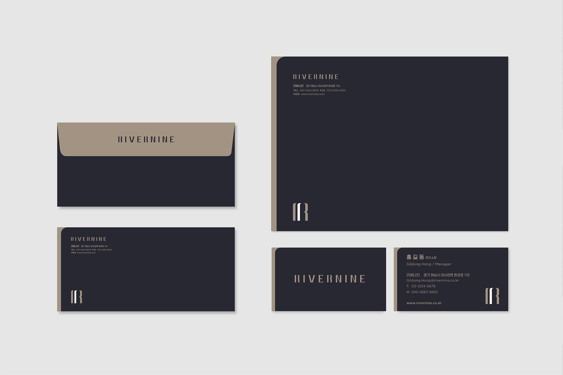
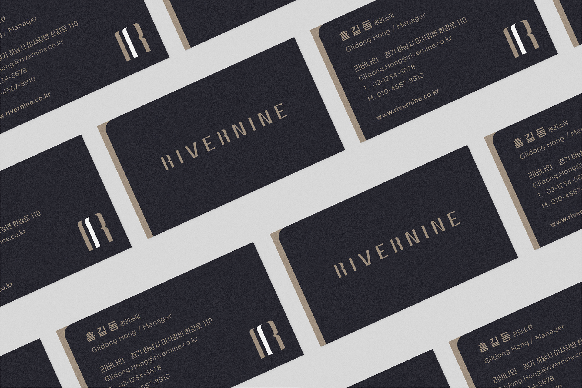
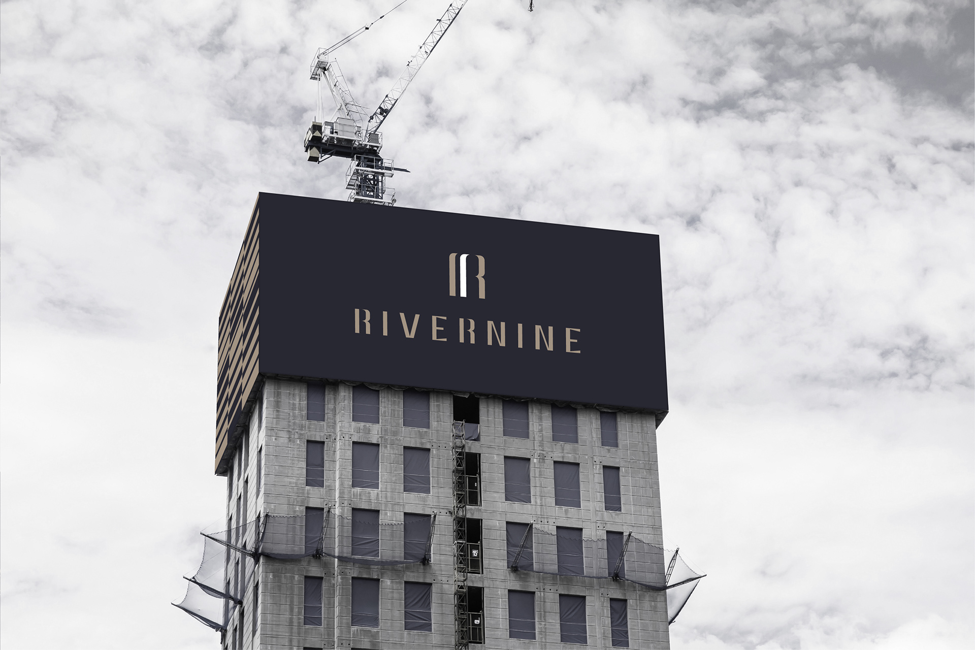
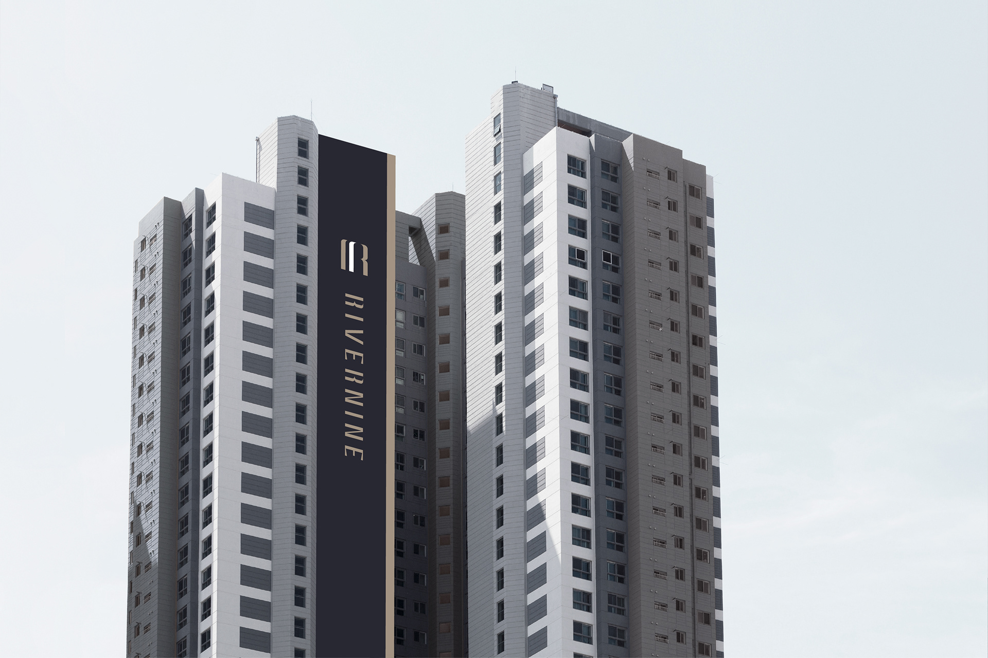
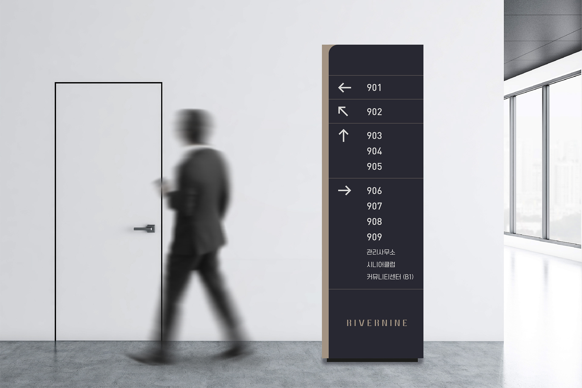
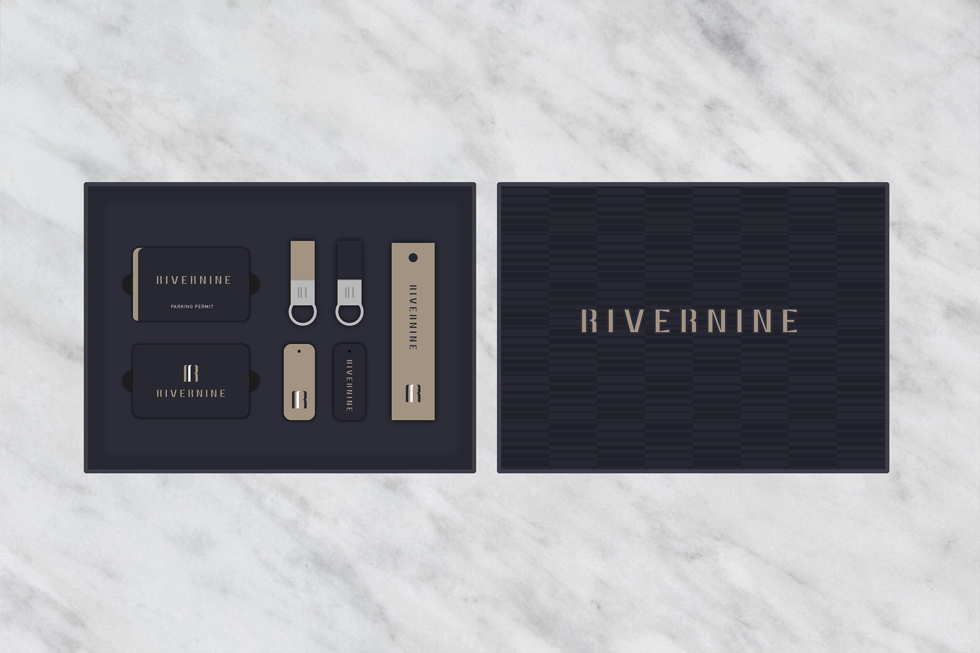
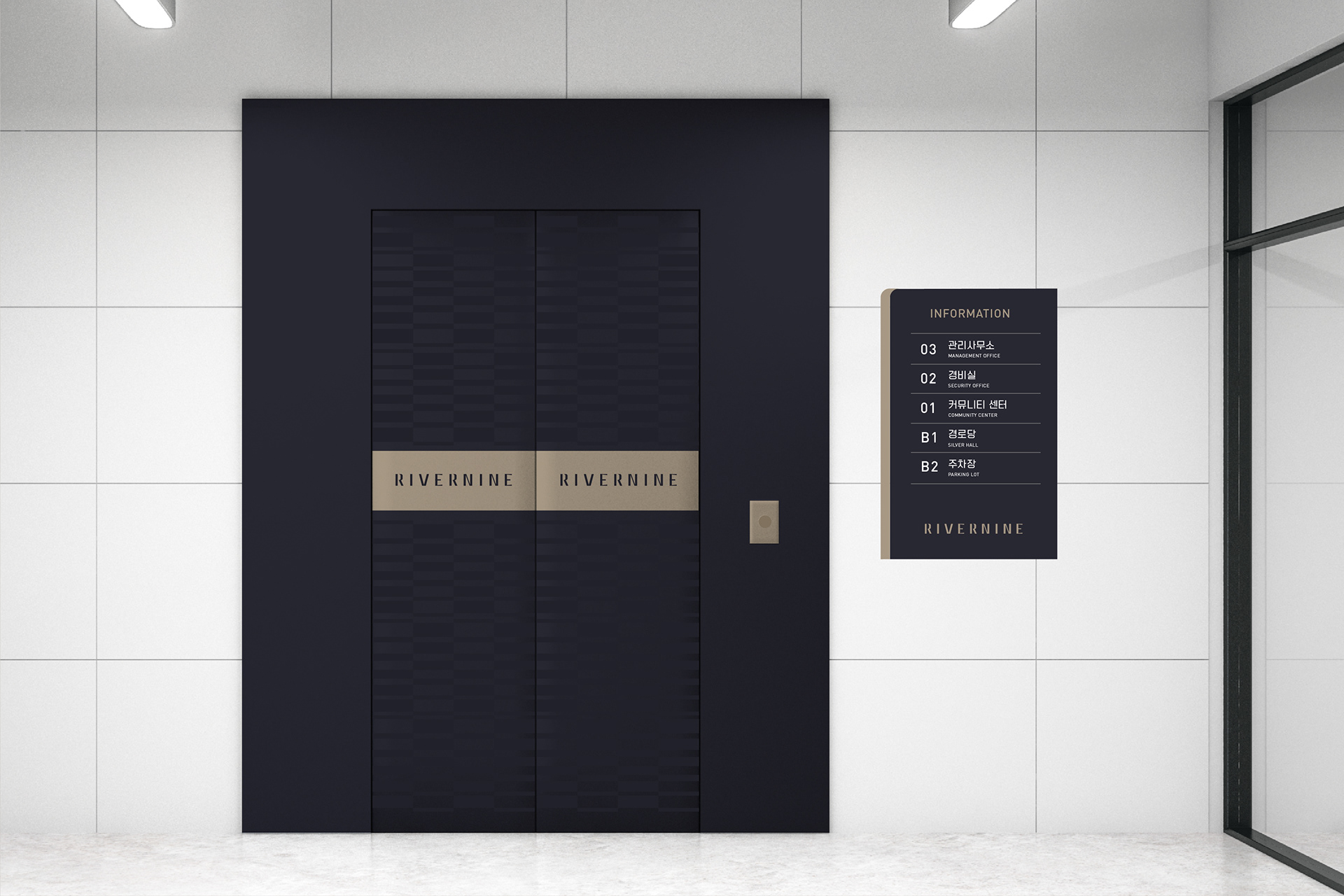
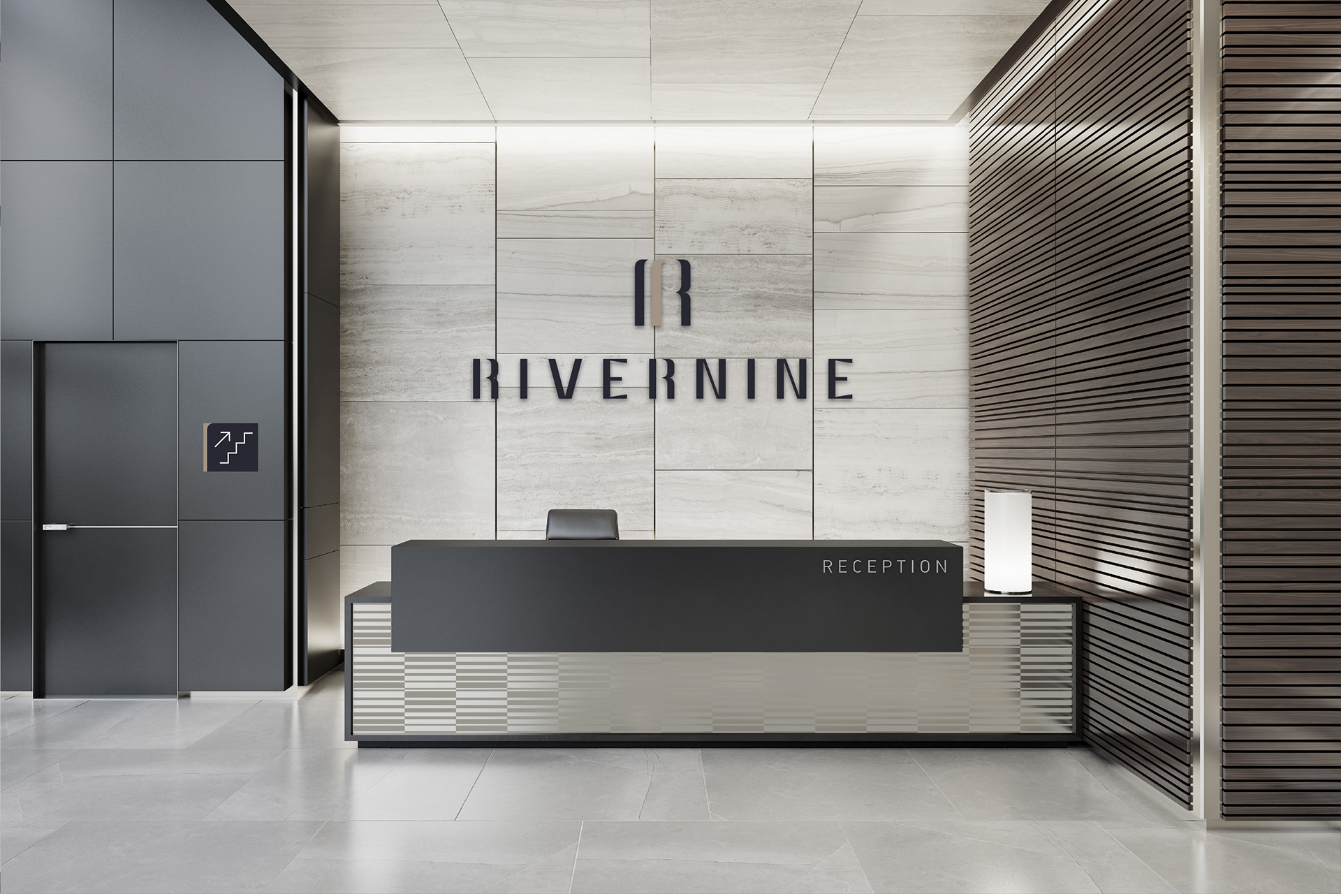
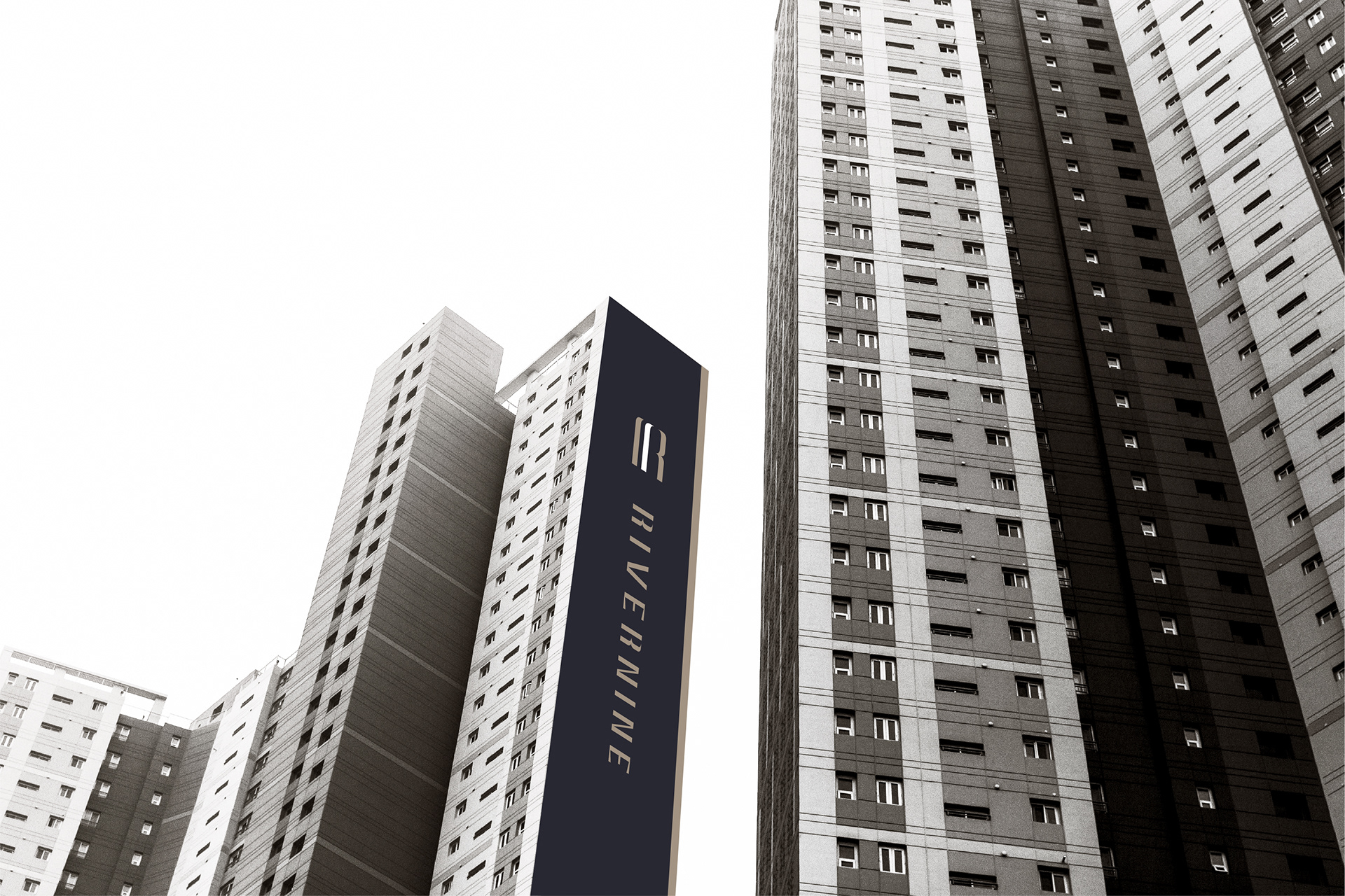
RIVERNINE BRAND IDENTITY & SIGNAGE SYSTEM
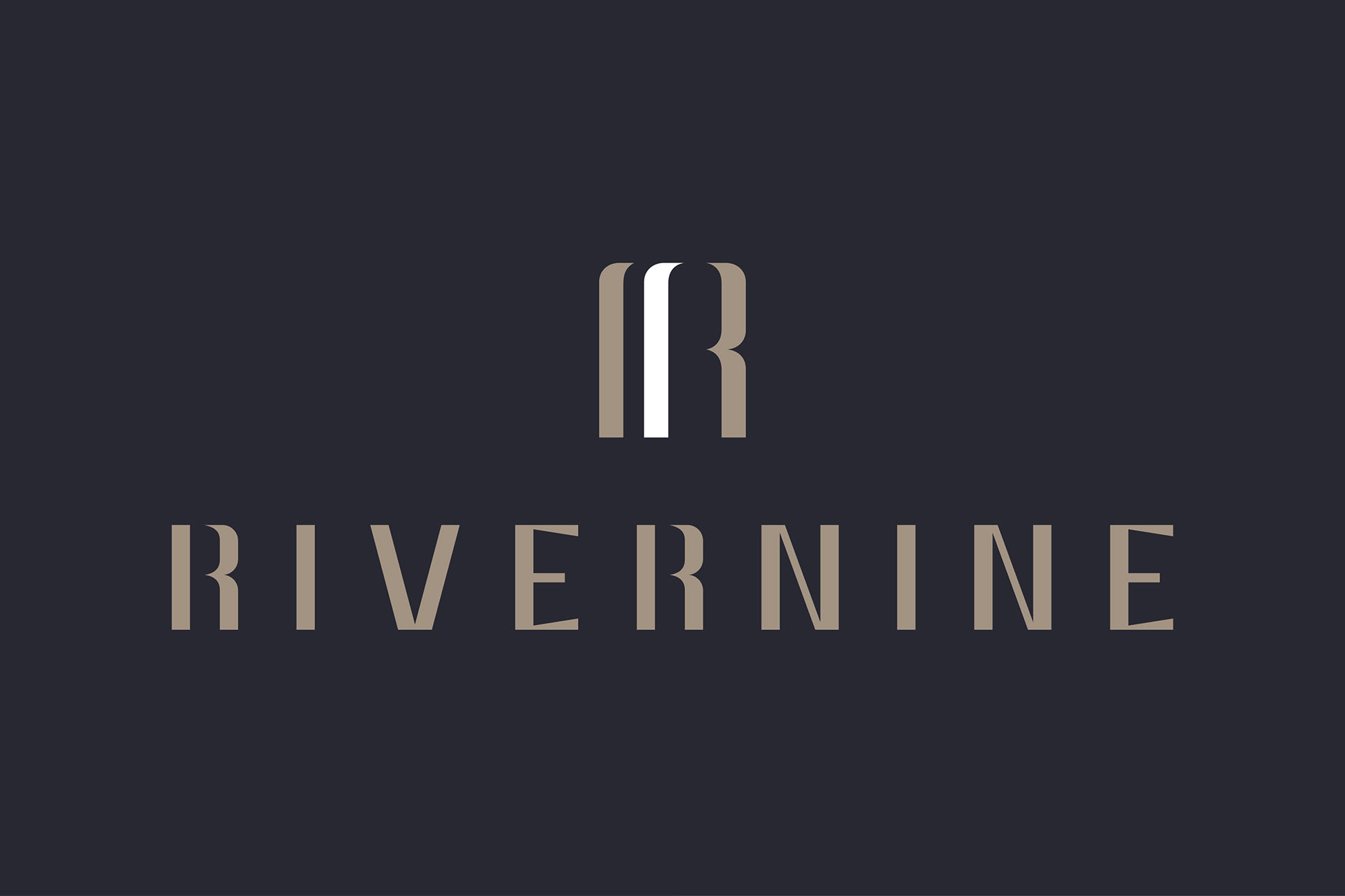
'RIVERNINE' is a brand that has a premium view of the Han River. It offers a unique and elegant lifestyle to customers. The brand design was carried out with the brand value of 'RIVERNINE', which provides a leisurely life for me with nature. 'R', which contains the initials and the most important metaphore, which can represent the naming of 'RIVERNINE', is designed as a representative symbol by expressing the alphabet 'R' as a curve like a river wave. By establishing a brand identity and Signage system, we provide residents with a new brand experience.
'리버나인'은 미사의 중심인 아파트 브랜드로 한강 프리미엄 조망권으로 고객에게 남다른 한강 라이프스타일을 제공합니다.
자연이 있는 여유로운 삶을 제공한다는 리버나인의 브랜드 가치를 담아 Brand Identity 개발 및 Signage System을 개발 진행하였습니다. '리버나인'이라는 네이밍을 대표할 수 있는 이니셜이자 가장 중요한 메타포인 RIVER(강)을 담고 있는 알파벳'R'을 강의 물결과
같은 곡선으로 표현해 대표 심볼로 디자인 하였습니다. 브랜드 아이덴티티 및 사이니지 시스템 구축을 통해 입주민들에게 '리버나인'만의 새로운 브랜드 경험을 제공합니다.
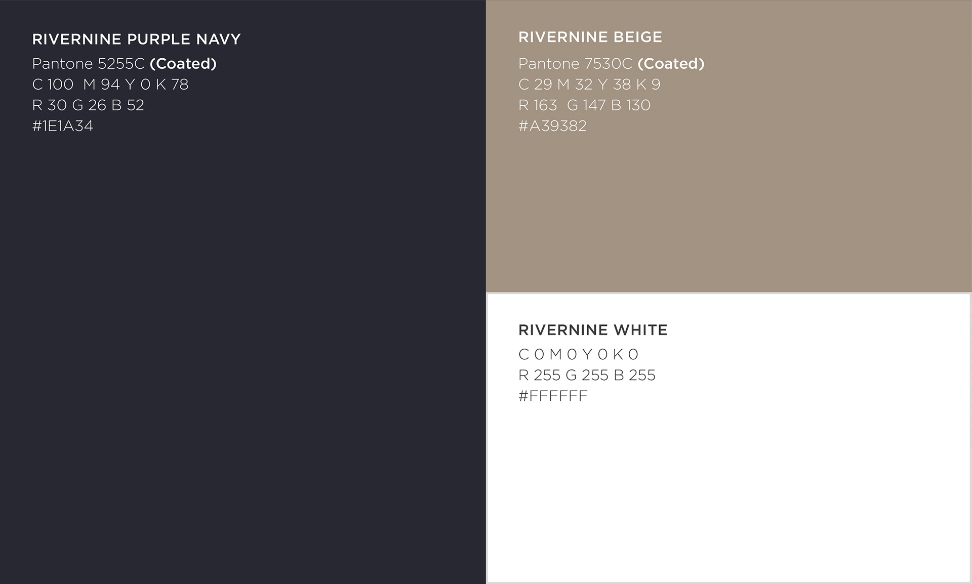
COLOR SYSTEM
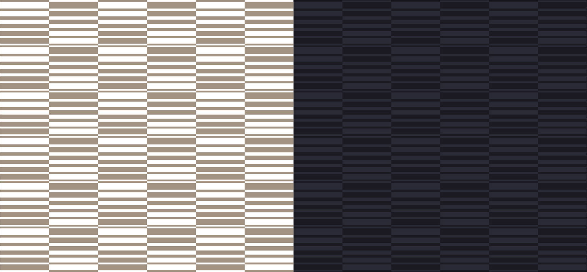
GRAPHIC PATTERN

RIVERNINE BRAND IDENTITY
-
DATE : 2020.12
-
CLIENT : RIVERNINE
-
DESIGN : LAY.D (WWW.LAY-D.KR)
-
FILED UNDER : BRANDING, COMMUNICATION, EVENT / PROMOTION